Jill, Sabryna, Megan, Parker and I decided to redo a marketing campaign for an existing company called Intermountain Golf Cars. Jill redesigned the logo and wrote the personas, Megan did the mock-up of the golf cart design, Parker shot the commercial and Sabryna designed the brochure and the actual golf cart materials we used for the student government golf cart.
Our Communication Objectives:
Our product will help in creating and establishing a campus identity, and serve as a recruiting tool.
When recruiting students, our product will establish credibility for the University.
Our brand promises the best quality- when you see our logo you know you're getting the best.
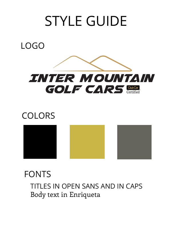
Individual artifact:
The artifact I was responsible for was the creation of the website and the style guide. On our style guide we chose black, gold and gray for our colors for a clean and sophisticated look catering to the administrators who will be viewing the page to make decisions about their school's golf cart needs.
The website design integrates these colors to make a clean and easy to read website. Our design follows the LZ format, to accommodate how people usually view webpages. The navigation bar is easy to use and all of the important information is easy to find.
I used the Spring Mountain Motorsports website for inspiration, we loved the clean and minimalist feel, and it was similar to Intermountain Golf Cars current website, so that when we present it to them it isn't too foreign.
http://www.springmountainmotorsports.com/
Our URL is: carlyjaneradmall.wix.com/intermtn-golf-cars
Our group chose the ending scene from the 2011 movie, Hugo. This scene uses the steady cam filming technique, and we thought it was very interesting to watch.
Carly- Director: My assigned role was director, and this movie was directed and co-produced by Martin Scorsese. Looking at this scene from the point of view of the director, I found it amazing how much work had to go into this ending scene. In film-making, the director is the one who visualizes the script and makes sure that the visualization is executed through production design, artistic elements, and through selecting the talent. The director is the main person who works with the talent, and this is to ensure that they can execute his/her visualization of the script.
For this scene, Martin Scorsese had to work with all of the talent and make sure that they were doing what they were supposed to be doing when the steady cam came around to them. All the talent had to be in character during the whole steady cam procession.
Another important part of this scene was the wardrobe, hair and makeup. Scorsese had to ensure that everything looked the way he wanted it to in order to portray that 1930's Paris vibe. The artistic elements of this scene communicated cultural context very well. The wardrobe as well as the way the talent behaved during this scene really transported the viewers to 1930's Paris.
When analyzing this scene it was very easy to see how all of these different responsibilities are intertwined and have to work together to make a movie possible
Jenilee- Art Director: In our group I chose to be the art director, who foresees a lot when it comes to any film production. They are responsible for visual style and images. They create the overall design of a project and direct others who develop artwork and layouts. They focus on light/color: color patterns, hues, soft and hard. They also focus on the interior and exterior of the set, costume, hair makeup and many more responsibilities.
During pre-production, they work on overseeing the preparation of the first sets required and keep tight control on the budget. They are also responsible for commissioning all special effects, hiring vehicles and organizing the casting of all animals. During the film, art directors continue to oversee the construction, dressing and demolishing the remaining sets. Post-production they must verify all sets are struck and locations cleared; also that art department bills are paid.
Principles of Contrast:
Color- There is a lot going on with the lighting that makes it cozy but intriguing. The hues (spectrum of color) are rich and warm, to give to the feeling that it was indeed in the 1930’s. They actually watched films of the Lumiere brothers and silent films of the 20’s to study the period’s tinting and toning. They also ended the film with the robot and everything was dark in the room and the sky was dark outside.
Space- The space of the room was a perfect balance of the area and how many guests that were at the party. There was also not a lot of clutter in the furniture and the décor and they both were simple yet classical. I am in charge of making sure that everything within the frame is perfectly placed at any given time.
Texture- I noticed different areas of texture in all different aspects. The first scene of the outside building is rough and not pleasing but then when you enter the window, it is smooth when it comes to the walls and flooring. There is texture differences in their costumes and some ladies are wearing silk dresses and others are not.
Costumes- The men were in either suits or tuxedos and ladies in rich toned dresses. Since this is the last time to see all of these characters I like how their costumes are a little more fancy and dressier than what you would see them in throughout the rest of the film.
Gestalt Principles:
Law of Closure- This ending scene demonstrates this because even though it is not showing everything in the room, you still know it is there. This scene gives us as audience members a unique perspective because it is almost as if we were the guest that is walking around the party. I feel as if throughout the movie you are getting to know all of the people in the room and then you are able to be close with them at the party.
Janet - Production Designer: The production designer is the big picture person. They are responsible for maintaining a consistent look throughout the film. They work closely with the director and director of photography.
Subordinate to them is the locations, art department and special effects division, among other things. Production design is shown in the last scene of Hugo, first by the camera nearing the building and seamlessly going through the window into the inner chamber. This first effect corresponds to other parts of the film that have an "other worldly," slight fantasy aspect to them. The seamless feeling carries throughout the steady cam operation as it winds and swirls methodically through the populated space.
The lighting is subdued and people are visiting and interacting pleasantly. The decorations, clothing, hair and makeup all effectively convey an early 20th century European environment. The use of plain colors, with smatterings of bright, mostly red tones draw attention to key characters. Finally, the moderately lit room containing the robot are cool, somber tones. This can represent the longing of a child for his parent, as carried out in the plot.
Russell - Director of Photography: My job is the director of photography, this person is over the cameras and lighting. He is responsible for making sure that all the camera angles for the different shots are set and correct, also he makes sure that the lighting fits the shot. In the last scene of Hugo, this was shot using the steady cam, as to make you feel like you were following the main character around as well as any guests that were there. They had to use camera lenses that open up enough to let the scene be seen, it was all done in a subdued lighting,
There are many people interacting with each other, the girl is telling about the book and about the main character, you see people dancing, then the final shot moves in on the robot in an outer room all by himself.
Setting up a shot like these takes an awful lot of work, you need to measure from the focal point on the camera to where the actor is placed, and keep notes so that if you need to reshoot it you have a reference to go back to, you need to know the aperture setting on the lense, as well as the shutter speed, and the ISO setting so the shot isn’t underexposed or overexposed. You have to measure the whole set making sure as to where everything is placed, which is usually marked with gaffers tape, where the stop points are for the actors, also marked with a piece of tape, chalk mark, an X, or even a T.
Being a director of photography is a lot of responsibility involved, just to make things all maintain continuity, that way the movie will flow, and the audience will be held spellbound, and mesmerized.
This all take all takes place in 1930’s Paris, where an orphaned boy who lives in the walls of a train station is wrapped in a mystery involving his late father and an automaton.
Overall How it was Filmed: The steady cam established the law of continuity because this ending scene was all filmed in one shot, and it goes through and you see all of the major characters in the movie and ends with the robot that brought Hugo and his father together. This way of filming also establishes a figure/ground relationship because the way the camera goes around, you see and hear what the actors immediately in front of the camera are saying as well as the people in the background who are also in the room. Another thing we noticed was the contrast in color- throughout the scene you see the important characters are all wearing bold and bright colors compared to those in the scene who were not major characters in the movie.
Film Credits:
Director: Martin Scorsese Director of Photography: Robert Richardson Art Director: David Warren Production Design: Dante Ferretti Principle Photography: Robert Richardson
I took this picture of my "not-so-happy" father while we were on vacation in California this summer. This photo is interesting to look at after learning about frame composition. Rule of Thirds
This picture follows the rule of thirds pretty well, my dad is the focal point of the picture, and he's not quite center but he's not completely to one side either. The horizon line is off centered in the frame as well, which breaks up the typical "horizon is smack dab in the middle of the frame" photos that you constantly see from people's vacation albums. The Diagonal Rule
This picture is interesting because it was taken on a pier and the railing is moves your eye through the frame to the left, in addition to this the ocean horizon line is at a slant headed in the same direction as the pier. This makes it interesting to look at. Vectors
In class we discussed how a subject's eyes can serve as a vector because they can lead the viewer's eyes through the frame as well. I think it's interesting in this photo because his body is facing the right but his eyes are looking toward the opposite side of the frame.
Over the weekend I visited ULTA, (a beauty and cosmetics store) and I caught myself laughing at some of the perfume bottles on display right as you walk in the store. Because of this, I decided to use perfume bottles for my good and bad design comparison.
Vera Wang Princess
and
Nicki Minaj Minajesty
Both of these perfumes are priced at $50 or more, and were actually found very near each other on the women's perfume display at ULTA. Which indicates that each perfume is trying to target the same demographic, women shopping at ULTA who are willing to fork out at least $50 for 1.7 ounces of perfume. Generally when they group perfume in a store like this, they group perfumes that have the same "notes" together. So that women will pick up multiple perfume in a given section because they all have similar notes but each one is different. These perfumes are also supposed to be, "fun and flirty."
For these two perfumes, I am going to analyze the light, shape, color, balance and law of simplicity.
Light:
Princess is in a transparent bottle, and it's kind of hard to see in the picture, but the bottle is actually faceted (like diamonds are) to reflect light and make the bottle look prettier. Minajesty used a mixture of shiny plastic and metallic paint to make it reflective. (and if the sun hits it just right, it might blind you.)
Shape:
The Princess bottle is heart-shaped, and fits perfectly in your hand when you go to spray it. The Minajesty bottle is awkward, because you have to take Nicki Minaj's head off to spray it, and the bottle doesn't feel like it naturally belongs in your hand when you hold it. Rarely do I buy a perfume bottle that is really awkward to use.
Color:
The Princess bottle's glass is clear, but the perfume itself is purple. The purple with the gold on the crown-shaped lid topper go together nicely and looks sophisticated. Minajesty is a different story, we have gold metallic, pink, black, red, a second gold, as well as silver going on here. In my opinion it's a bit busy when you first look at it.
Balance:
Despite the many differences between these two perfume bottles, I believe they are both pretty symmetrical as far as the bottle shape and artwork goes.
Law of Simplicity:
The overall design of Princess is simple, and it's heart shape, curved lines and facets make it look feminine and sophisticated. While Minajesty is balanced as far as symmetry goes, with all of the different colors and shiny-ness, it makes it look busy and complicated. This makes it look childish and not sophisticated at all.
For this assignment, my group went to the Holland Centennial Commons Building to find examples of Gestalt principles in architecture.
This is my example for figure-ground:
This year I decided to be my family photographer on our annual Kennedy family beach trip. I was really discouraged with how difficult beach photography is, but I was pleased to see that by the end of the week I had somewhat-mastered Manual mode on my Canon Rebel T3.
So let me introduce to you one of my favorite photos of the week, and probably one of the best pictures I've ever taken.
I see the contrast in the colors of his swimsuit, eyes, and the water. They are all different shades of blue, but they all seem to connect the picture through colors. These shades of blue seem to create harmony throughout the photo as well, like everything in the frame is included for a reason. The colors also maintain the beachy theme that this photo exudes. I also like the contrast in the depth of field, Jackson is in the foreground and in focus, while the water and sand behind him are blurred. I also like the angle of this picture. He's looking up at me, and so the lower parts of his body become blurred and part of the background almost. In this picture, we're actually standing underneath the pier. So, the light pattern coming through that we can see on the water is from the spaces between the boards on the pier above us. I think this creates a sort of contrast as well between shadows and light, as well as creates an asymmetrical pattern as far as balance goes. I like that there isn't anything symmetrical about this picture because it makes it interesting to look at.
I selected this picture (of a picture) for my visceral response because I remember exactly how I felt when I first saw it. I was walking around The Met in New York when I saw this painting and I remember stopping and actually audibly saying, "Wow." I spent at least 15 minutes standing in front of this one just looking at it and taking in the colors and designs. There are so many things about this painting that makes it interesting to me. First, as I briefly mentioned above, I loved the colors in this painting. I believe this painting contains every color of the rainbow, and so that made it exciting to look at. Not only does it contain all of the ROYGBIV colors, it's got different hues of each color as well. Some of the colors are more intense and vivid than others, and I really like the combination of hues and values throughout the painting. I also like that it contains many triangular shapes as well as some designs that don't even look exactly like any particular shape at all. When I first looked at this painting, I actually didn't know what to look at first. I think part of what provided that experience was the way the painting is actually hanging. It didn't look like everything else hanging in the Met, it was actually hanging about 45 degrees differently than all the other paintings. That added to the overall quality of different shapes happening in this painting. This rotation also helped with the line of the painting, it directed my eye to the very top corner of the painting, and then I looked at it in a clockwise motion because of how the shapes and colors are placed. I don't know that this painting has an exact vertical or horizontal line to it, but I like to think that the line was a clockwise circle that directed my eye around the entire painting. The intense colors, various shapes, and unique hanging really had me in awe at the museum. I wish this wasn't in the Met, because I'd like it to be in my apartment! It's so beautiful and really created the stupefying feeling for me when I saw it.